
When scrolling through the BBC homepage, your Twitter feed or Facebook threads, which elements grab your eye? Chances are, the answer is visual content. This has big implications for accountant marketing.
Text will always be an important means of communication for accountants, when it comes to connecting with current and potential clients. Yet there is a realm of high-potential engagement tools at your disposal as well, in the form of infographics, graphs, animated GIFs, images and charts.
This is the point where a lot of accountants balk: “I’m not creative or visual at all! How am I suppose to even start using that sort of thing in my marketing?”
It’s a legitimate question, and the good news is you do not have to be naturally artistic to leverage these sorts of amazing, visually-stimulating tools in order to capture your audience’s attention.
There are some great, user-friendly tools out there which allow you to create a lot of these things yourself, often for free. Canva, for instance, is a simple, online graphic design tool which allows you to create free infographics and social media graphics.
Having said all that, it does really help to have a basic grasp of colour theory when accountants try to use these sorts of marketing tools. In this article, we’re going to cover the essentials for you…
Colour Theory in Accountant Marketing
You probably remember primary, secondary and tertiary colours from school.
If not, here’s a quick recap:
Primary colours are the main colours. They cannot be created by mixing other colours, and include:
- Blue
- Yellow
- Red
Of course, there are different shades and tints of these colours. You can also combine two or more of these colours to create other colours.
When you mix two of them, you end up with a secondary colour:
- Orange (red + yellow)
- Green (yellow + blue)
- Purple (blue + red)
You get a tertiary colour when you mix a primary and secondary colour together. It’s from this point that colours become quite complex, and it’s often here that branding experts, graphic designers and senior accountant marketers like to spend their professional time.
For you as an accountant looking to use colours in your marketing, one important thing you remember if that not all primary colours mix with all secondary colours. For instance, blue and orange do not mix together very well – typically creating a muddy, ugly brown.
Rather, primary colours mix well with secondary colours which sit next to them in something called the “color wheel”, represented here:
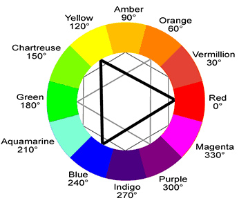
So, as you can see here, the primary colour blue mixes well with the secondary colour purple. The result is indigo. Blue and green, moreover, can be used to make teal.
How to Choose a Colour on Your Computer
If you’ve tried the Canva software mentioned above, or any kind of basic design programme for that matter, then you will know that there are a lot more colours than those which we’ve mentioned.
The reason for this is because you can have different shades, tints, tones and hues for each colour.
Briefly, here is a definition of each one:
- Hue: Often seen as synonymous with the word “colour”. For instance, all of the primary and secondary colours which we’ve mentioned are “hues.”
- Tone: When you alter a colour by adding black and white to it. Another word for tone is “saturation”, which is more commonly used when talking about digital images.
- Tint: When you add white to a colour
- Shade: When you add black to a colour.
When it comes to choosing a colour on your computer, different kinds of colours will be represented either through a system called CMYK, or another one called RGB. In both systems, you enter a code to identify the precise colour you want to use in your accountant marketing materials.
CMYK is shorthand for Cyan, Magenta, Yellow, Key (Black). These are the same colours used in your office printer, and it uses a number system between 0-100. So, if you choose “0” as the value for C, M, Y and K, you end up with white. If all of the values are 100, you get black.
RGB is intended for digital colouring, and represents the primary colours (red, green and blue). In contrast to CMYK, RGB adds more white to the colour the higher the value is. The system works using values between 0 and 255, so black would be R=0, G=0, B=0. White would have all the values at 255.
How to Pick a Colour For Your Accountant Marketing
This is often where accountants focus their attention: “Great, so how do I actually know which colours to use for my Facebook posts, GIFs, infographics and other marketing collateral?”
#1 Be mindful of context
Colours do not typically work in isolation. They tend to sit near, or next to, another colour or set of colours to create contrast and effect.
Putting two colours next to each other can change your perception of the image they comprise. For exampe, if you want to make a line chart, do you really want both the line and the background to be white, or black? Almost certainly not. You need to create a contrast to make the image work.
#2 Use the colour wheel
Choosing contrasting colours isn’t really hard, however.
What’s more difficult is finding colours that work well together. For that, use the colour wheel above and spend some time working out what works.
Typically, you need to get a feel for the kinds of combinations that compliment one another.
#3 Start with a colour you like
If you just stare at a set of colours or the colour wheel, you will likely have no idea where to start. They can all look great in their own way, in different contexts.
So, a good idea is to start with a colour you’re particularly fond of, and work from there. This is much easier than trying to begin with two or more colours.
#4 Use Adobe’s free Color Wheel tool
Once you’ve picked a colour to start with, we recommend using Adobe’s free Color Wheel tool in order to find the different combinations that might work well in your accoutant marketing.